


UX | Systems | Strategy
ai | cx | ux
strategy | Systems
UX | Systems | Strategy
ai | cx | ux
strategy | Systems
AI, CX, UX, Systems and Strategy Intro
I develop research-driven UX solutions and systems, and responsible AI strategies through research and development partnerships with institutions and industry leaders across multiple sectors of design, tech and business.
With over 15 years spanning industry partnerships (ACMI, CSIRO, CareerDC Internships, REA Group, REGEN & NFPs, RMIT Blockchain Hub) and cross-sector collaboration, my approach integrates user research + applied UX, service design, and systems thinking to deliver outcomes that are both strategically sound and human-centered.
What I Bring to UX/AI Design and APplied Industry Research
Emerging Technology Integration
Responsible AI and explainable AI (XAI) frameworks
Blockchain/Web3 user experience design
Immersive technology UX (AR/VR/XR)
API integration and technical documentation
Cross-platform design (web, mobile, spatial)
Systems Thinking & Innovation
Service design and organisational transformation
Workshop Design and facilitation
Agile/Lean UX methodologies
Design operations (DesignOps) and scalability
Cross-functional team collaboration
Change management and adoption strategy
Strategic Research & Discovery
User research methodologies (ethnographic, contextual inquiry, usability testing)
Stakeholder co-design and participatory workshops
Journey mapping and service blueprinting
Competitive analysis and market research
Data-driven insights synthesis
Interaction & Experience Design
UX/UI/CX strategy and execution
Information architecture and navigation design
Wireframing, prototyping, and iterative testing
Design systems and component libraries
Accessibility-first design principles (WCAG)
CSIRO Research Director, Dr. Justine Lacey:
"Cy's ability to synthesise complex ideas from our multidisciplinary teams at CSIRO and RMIT was instrumental... The UX design team at CSIRO Data61 were extremely impressed by Cy's work. The simple and intuitive user interface highlighted his mastery of human-centered design."
Featured Projects
Below you'll find case studies spanning:
Each project demonstrates how UX/CX and systems thinking can solve complex challenges through research-driven design, stakeholder collaboration, and strategic innovation.
Scroll to explore ↓
AI R&D
Industry-AI integration | UX | CX
research supervision | Devlopment
interaction prototyping
AI R&D
Industry-AI integration | UX | CX
research supervision | Devlopment
interaction prototyping
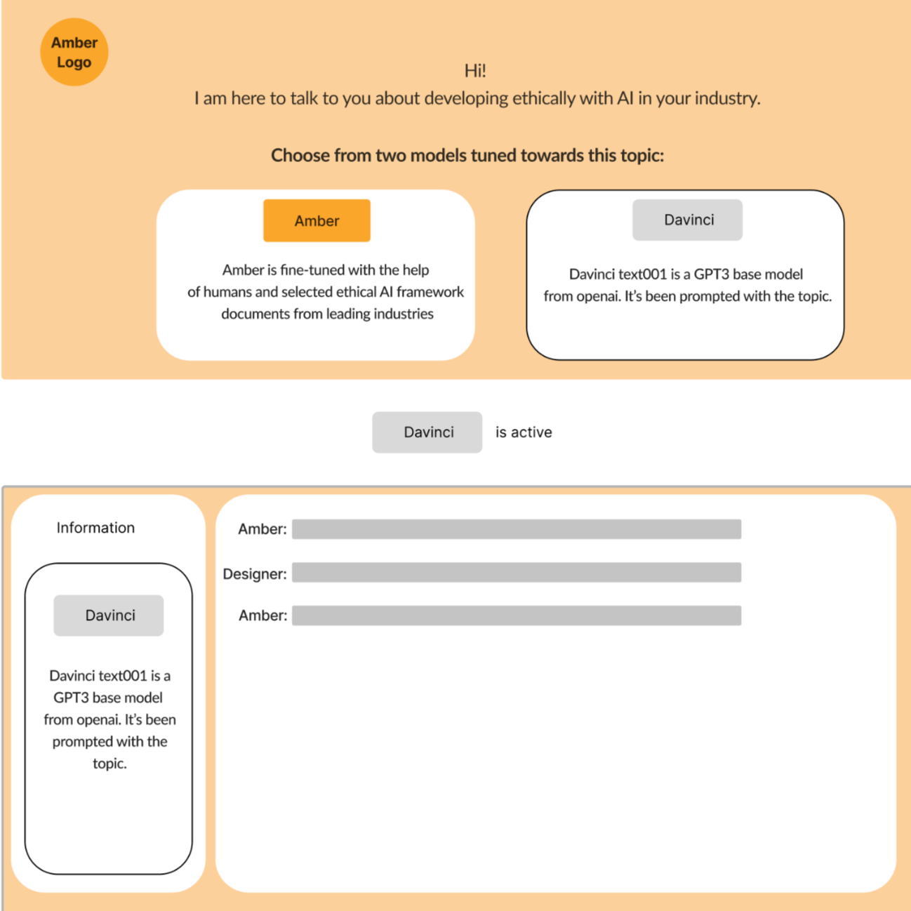
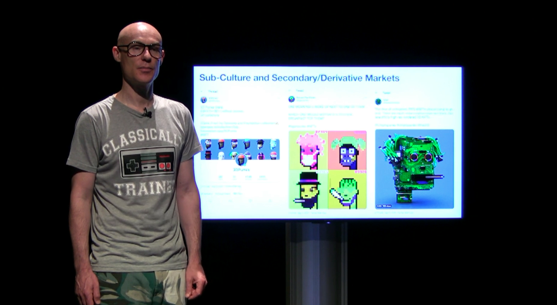
AMBER: Responsible AI & Explainable AI (XAI) Design
CSIRO/RMIT/Nurobodi Collaboration | Industry Research and Development Partnership
#ResponsibleAI #ExplainableAI #XAI #HumanCenteredDesign #UXResearch #AIEthics #ProjectManagement #IndustryInnovation
UPDATE JAN 2026:
Since this research was conducted in late 2022 (yes I’ve been in the space since 2022), the AI landscape has transformed dramatically. GPT-3 has evolved into GPT-5+ and beyond, with Claude, Llama, and countless other models entering the market. However, ChatGPT and foundational models brought AI to mainstream consciousness and there are already interesting and valuable UX/CX layers of information that are becoming harder to access. This article stands as a timely research and development project. I continue to work in the AI space, primarily focused on affective AI design for Human-Computer-Interaction (HCI), and responsible innovation of technological innovation.
What hasn't changed: The core challenges AMBER addressed—transparency, accountability, ethical deployment, human-in-the-loop design—are now more critical than ever:
The EU AI Act (2024) mandates explainability for high-risk AI systems
US Executive Orders require transparency and safety measures
Organisations worldwide are implementing responsible AI frameworks
Public concern about "black box" AI systems continues to grow (current Nurobodi R&D is focused on White Box-Black Box causal loop analysis)
The methodologies we developed in 2022—comparative model evaluation, ethical fine-tuning, XAI interface patterns—have become foundational to responsible AI practice. What was experimental then is essential now.
Project Introduction:
In late 2022, I led a research collaboration with CSIRO/RMIT exploring explainable AI—before the regulatory landscape caught up. We were developing human-in-the-loop methodologies and transparency frameworks examining white box (explainable AI) vs Black Box causal loops, that have since become mandated by the EU AI Act and industry standards. The specific tools evolved—GPT-3 to GPT-4 and beyond—but the core principles we established are now foundational to responsible AI deployment.
The challenge: How do we design AI systems that are not only functional but transparently ethical, explainable, and centered on human agency?
Why this research remains relevant: While the technology has evolved from GPT-3 to GPT-4+, Claude, and beyond, the core challenges AMBER addressed—transparency, accountability, ethical deployment—are now mandated by regulation (EU AI Act, US Executive Orders) and industry standard practice.

My Role: UX Lead & Project Manager
Responsibilities:
Lead UX/CX designer for chatbot interface and interaction flows
Project manager coordinating multidisciplinary teams (CSIRO researchers, RMIT faculty, Nurobodi developers)
Research strategist defining user needs, ethical frameworks, and success metrics
Stakeholder liaison ensuring alignment across organizational goals and timelines
Tools & Methods:
OpenAI API & Playground (GPT-3, precursor to GPT-4 and modern LLMs)
Google Colab (prototype development & model testing)
Mural (UX mapping, journey flows, stakeholder workshops)
Python/NLP libraries (data processing & embeddings generation)
Design thinking & human-centered design methodologies
Transferable Skills to Current AI Landscape:
LLM/API customisation & fine-tune prompt engineering (applicable to GPT4+, Claude, Llama, etc.)
Vector databases & RAG (Retrieval-Augmented Generation) architecture
RLHF (Reinforcement Learning from Human Feedback) principles
AI transparency interface design & decision audit trails
The Problem Space
Industry Challenge
AI systems were (and remain) increasingly deployed without transparency into how decisions are made. This creates:
Trust deficits - users don't understand why AI recommends certain actions
Ethical risks - biased or harmful outputs without accountability
Compliance gaps - regulatory frameworks demanding explainability (EU AI Act, etc.)
Adoption barriers - organizations hesitant to deploy "black box" systems
Research Questions
How can we design AI interactions that make decision-making processes visible and understandable?
What role does human-in-the-loop design play in responsible AI deployment?
How do we balance technical capability with ethical accountability?
What UX patterns support explainable AI without overwhelming users?
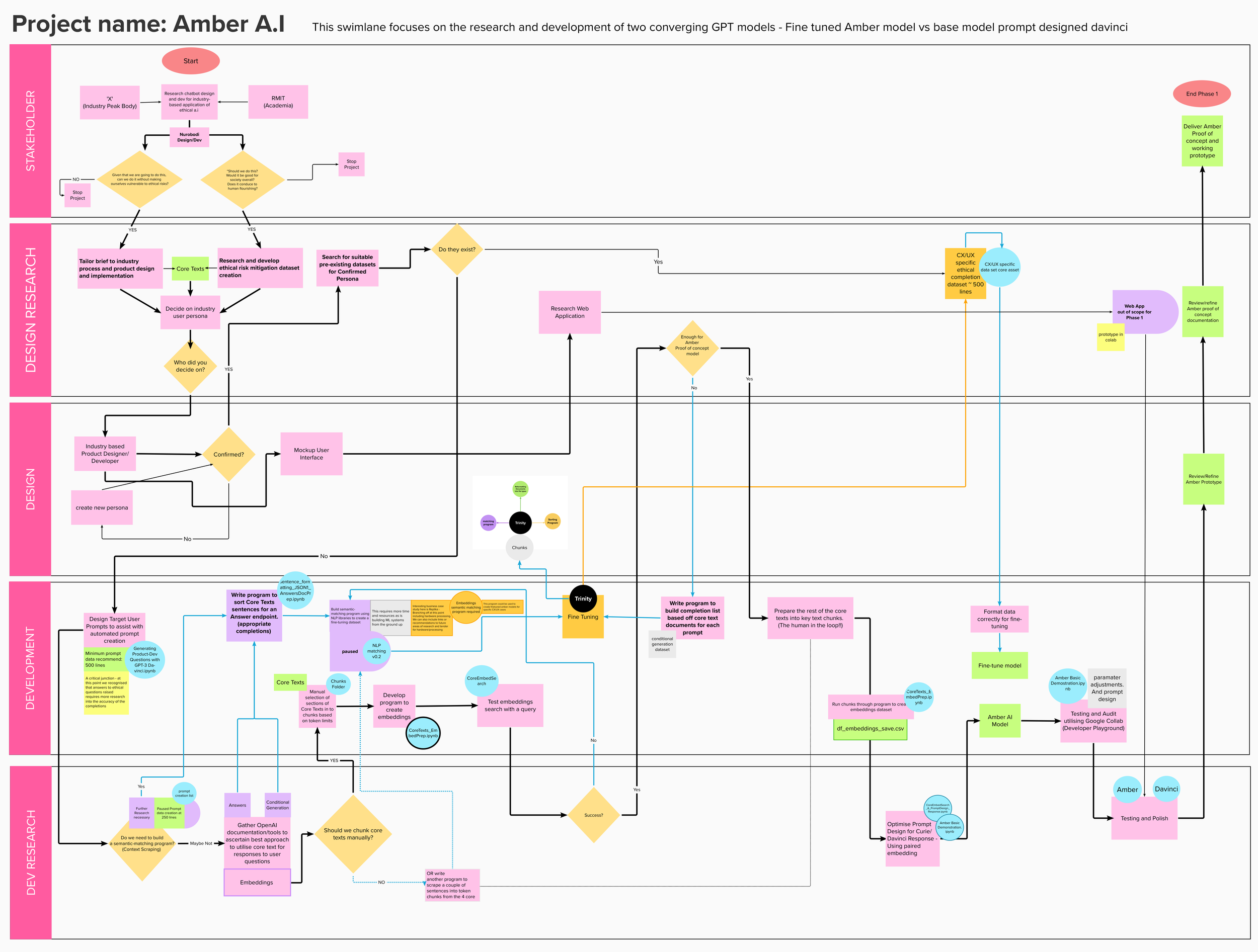
Phase 1: Discovery & Requirements Gathering
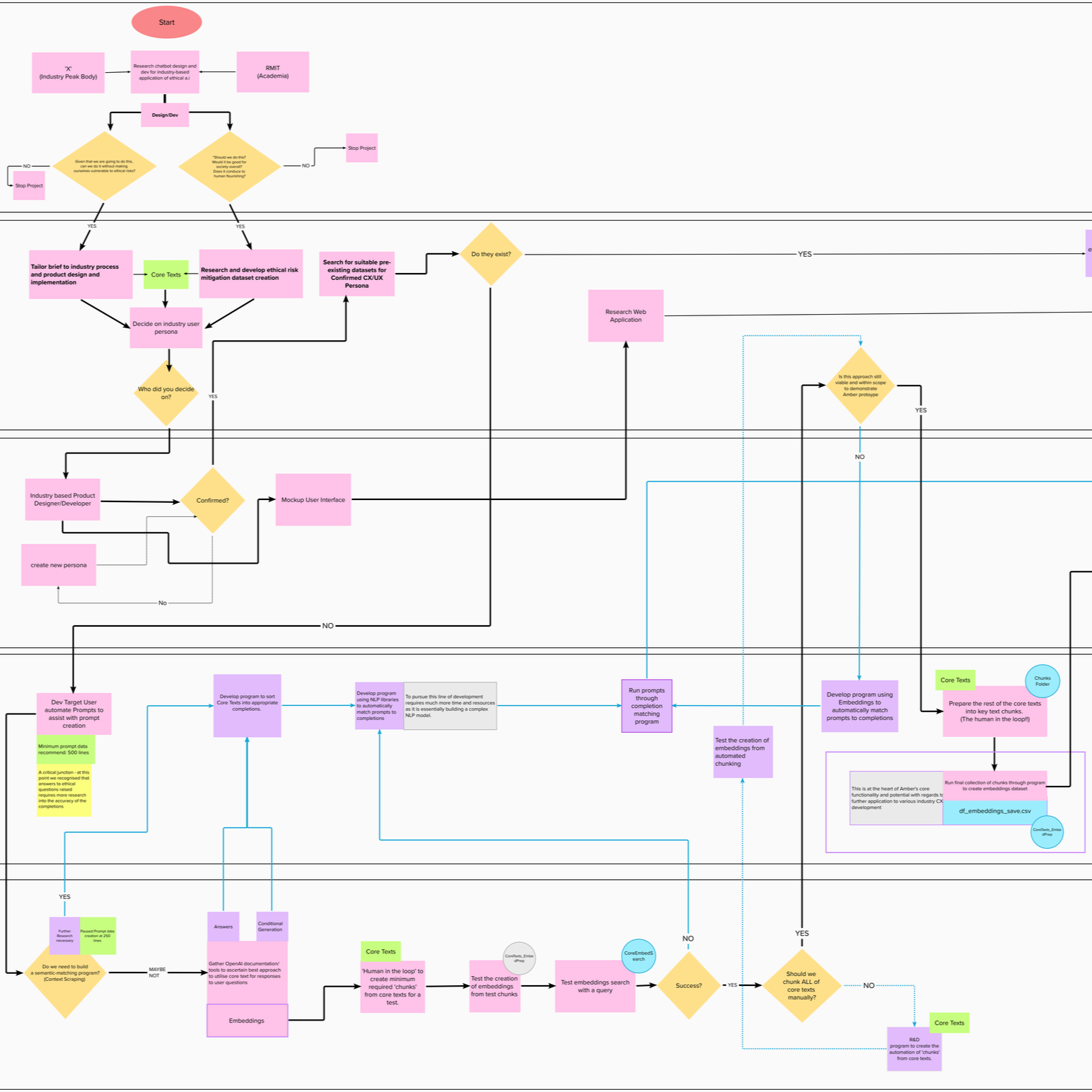
Stakeholder Workshops:
Facilitated co-design sessions with CSIRO researchers, RMIT faculty, and ethics specialists to define:
Core ethical principles (transparency, fairness, accountability, privacy)
User personas (AI developers, business decision-makers, end-users)
Success criteria (both technical performance AND ethical compliance)
Literature Review:
International AI ethics standards and frameworks
CSIRO's Responsible Innovation principles
XAI research (DARPA, academic publications)
Human-computer interaction best practices
Competitive Analysis: Evaluated existing AI interfaces for:
Transparency mechanisms (how do they explain decisions?)
User control and agency (can users challenge or understand outputs?)
Trust-building design patterns
Gaps and opportunities for innovation
Phase 2: Concept Development & Prototyping
Fine-Tuning for Ethics: Rather than using a base GPT model as-is, we fine-tuned it on:
International ethical AI standards
Responsible technology frameworks
Explainability principles
Human-in-the-loop methodologies
This created a chatbot that could reason about ethical considerations and explain its reasoning process to users.
UX Innovation: "Mindfulness as Mechanic" A core design principle: the interface should slow down decision-making and encourage reflection rather than instant, unreflective AI adoption.
Key UX Features:
Explainability Dashboard - Visual breakdown of how decisions were reached
Confidence Indicators - AI explicitly states certainty levels
Alternative Suggestions - Multiple options presented, not single "answer"
Human Override - Easy mechanisms for users to question or reject AI recommendations
Audit Trail - Transparent logging of interaction history
Phase 3: Iterative Testing & Refinement
Usability Testing:
Multiple rounds with target users (researchers, business stakeholders)
Think-aloud protocols to understand mental models
A/B testing of explainability mechanisms
Feedback integration and rapid iteration
Comparative Analysis:
Base model vs. AMBER (fine-tuned) dual-outputs compared
Qualitative analysis of reasoning quality between the base model and fine-tuned model
User comprehension testing (do they understand WHY AI made recommendations?)
Deliverables & Outcomes


Technical Outputs
Working Google Colab prototype demonstrating XAI principles in action
Fine-tuned AI model trained on ethical frameworks
UX/UI design system (Mural) for explainable AI interactions
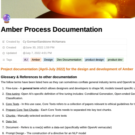
Research and Development documentation of methodologies and findings (including pseudo-code visual mapping)
Strategic Outputs
Framework for human-AI co-reasoning applicable across industries
Design patterns for explainability that other teams can adopt
Recommendations for responsible AI integration in organizational contexts
Case study demonstrating ethical AI is both technically feasible and user-friendly
Industry Impact
Presented to CSIRO Data61 UX team and leadership
Documented methodologies for future CSIRO AI projects
Contributed to broader conversations about responsible AI deployment
CSIRO Validation & Recognition
Dr. Justine Lacey, Research Director of Responsible Innovation, CSIRO:
"Cy played a pivotal role in the AMBER Project, leading both the design and project management. The project tackled significant challenges of integrating ethical considerations into AI technology—a topic of increasing importance in the field."
"Cy's ability to synthesise complex ideas from our multidisciplinary teams at CSIRO and RMIT was instrumental in the development of AMBER... His work went beyond merely addressing the project's immediate goals; he explored possibilities that could influence future industry standards for ethical AI applications."
"The UX design team at CSIRO Data61 were extremely impressed by Cy's work. The simple and intuitive user interface and usability highlighted his mastery of human-centered design... He envisioned and delivered a chatbot prototype that not only assisted users in understanding ethical principles but also facilitated transparent, explainable AI decisions; a critical advance in human-centered design."
Key Insights & Learnings
UX for Explainability
Challenge: Making complex AI reasoning understandable without oversimplifying
Solution: Layered information architecture - quick summaries with expandable detail levels
Human-in-the-Loop as Design Principle
Challenge: AI systems often position humans as passive recipients
Solution: Design patterns that explicitly invite questioning, override, and co-reasoning
Ethics as Feature, Not Constraint
Challenge: Ethical considerations often seen as limiting innovation
Solution: Demonstrating that transparent, explainable AI builds trust and adoption
Interdisciplinary Collaboration
Challenge: Bridging technical AI research, UX design, and ethics frameworks
Solution: Regular co-design sessions, shared vocabulary development, visual communication
Legacy & Continuing Relevance
Despite being developed in 2022, AMBER's principles have become increasingly critical:
Regulatory mandates - EU AI Act, US Executive Orders now require explainability
Industry adoption - Human-in-the-loop design is standard practice for responsible AI
Public trust - Transparency remains low; XAI patterns more important than ever
Organizational need - Companies require frameworks for ethical LLM deployment
Methodological foundation - Comparative evaluation, ethical fine-tuning approaches now mainstream
The technology evolved (GPT-3 → GPT-4 → multimodal models), but the core challenges—trust, transparency, accountability—remain unchanged.
Industry Impact Demonstration
This project showcases:
Strategic thinking - Framing complex sociotechnical challenges
UX research rigor - Multiple methodologies integrated cohesively
Stakeholder management - Navigating academic, government, startup contexts
Innovative design - Creating new patterns for emerging technology
Project leadership - Coordinating multidisciplinary teams to delivery
Industry validation - CSIRO recognition and documented impact
Forward-thinking - Work remains relevant as AI regulation evolves
AMBER Deep Dive
For comprehensive documentation of research methodologies, technical implementation, and ethical frameworks:
Read the full AMBER case study on Nurobodi →
Related Work
Want to understand more about my approach to AI, ethics, and human-centered design?
Networked Immersive Screen Environments
networked Systems UX |immersive INstallation UX
Data Visualisation | Distributed media networking
Networked Immersive Screen Environments
networked Systems UX |immersive INstallation UX
Data Visualisation | Distributed media networking
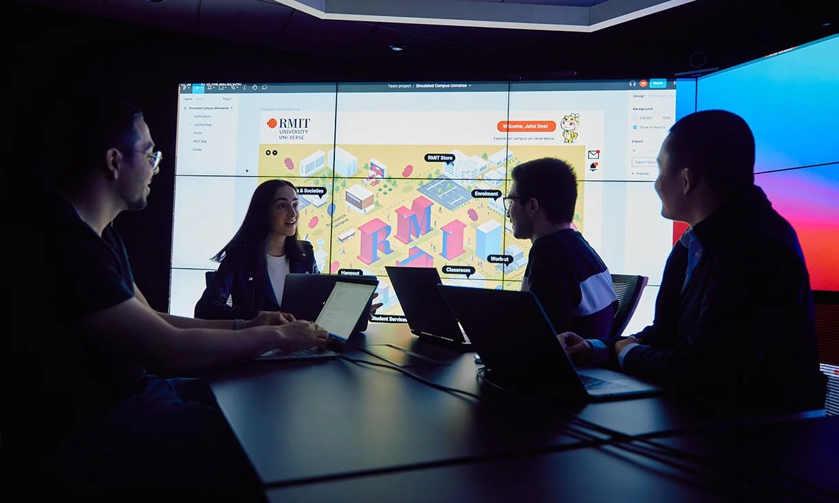
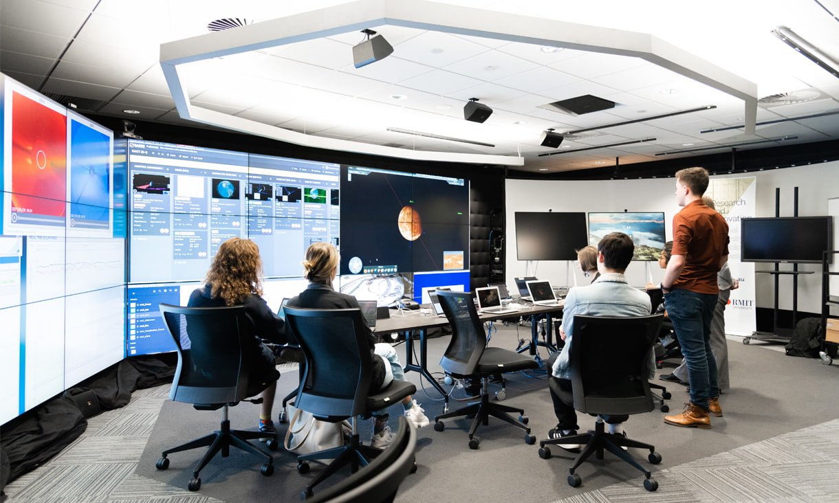
RMIT VX Robotics Lab: Multi-Screen Array Innovation
Co-Design for Networked Systems | Technical Innovation | Interdisciplinary Design/STEM Collaboration
#UX #XR #Interdisciplinary #Strategy #Research #SpatialDesign #SystemsThinking #Innovation #ProjectManagement #EmpathyDesign

The Challenge
How do we expand the capabilities of advanced research facilities to serve both technical innovation and creative education?
RMIT's Virtual Experiences Laboratory (VXLab) featured a sophisticated tiled display technology—an array of networked screens capable of ultra-high-resolution visualization. While powerful for robotics research and engineering simulations, its potential for immersive design, collaborative creativity, and experiential learning remained unexplored.
The opportunity: Pioneer novel use cases that bridge technical capability with human-centered design.
Overview
Working directly with Dr. Ian Peake (Technical Manager, VXLab), I proposed and implemented innovative methods for the VX Lab's multi-screen array that extended its functionality beyond engineering applications into immersive audiovisual design, affective interaction research, and collaborative learning experiences.
My role: Strategic design lead, project manager, and technical coordinator—bridging creative objectives with existing technical constraints.
Innovation Objectives
Technical Expansion
Develop custom tools for synchronized multi-screen audiovisual content
Explore distributed, networked visualization beyond single-user workflows
Push the boundaries of resolution, scale, and synchronization capabilities
Create replicable frameworks others could build upon
Educational Integration
Transform research lab into teaching resource accessible to design students
Demonstrate applications beyond STEM disciplines (design, psychology, creative practice)
Enable student projects that wouldn't be possible with standard equipment
Build cross-disciplinary collaboration between design and engineering
Creative Exploration
Test immersive audiovisual installations at unprecedented scale
Prototype affective design experiments using distributed visual systems
Explore empathy design through composite identity visualization
Create experiences that blur boundaries between physical and digital space


Project Methodology
Collaborative Co-Design Process
Phase 1: Discovery & Ideation
Technical consultation with Dr. Peake on system capabilities and limitations
Brainstorming sessions identifying novel use cases
Prototyping workflows for multi-screen synchronization
Testing technical feasibility of proposed applications
Phase 2: Development & Testing
Custom tool development for ultra-high-resolution content distribution
Synchronization protocols for networked screen arrays
Student training on system operation and creative possibilities
Iterative refinement based on real-world usage
Phase 3: Implementation & Exhibition
Student-led projects utilizing the expanded capabilities
Public exhibitions demonstrating technical and creative outcomes
Documentation of workflows for future use
Knowledge transfer to VXLab staff and other educators


Key Applications Developed
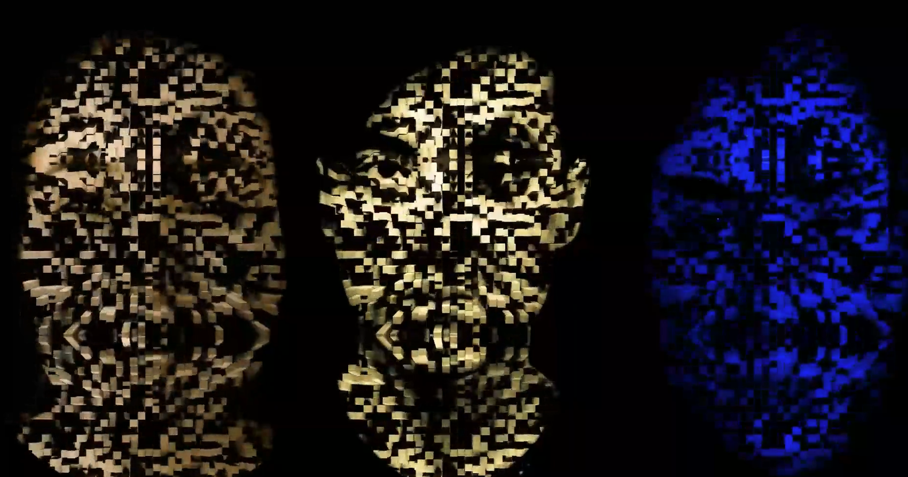
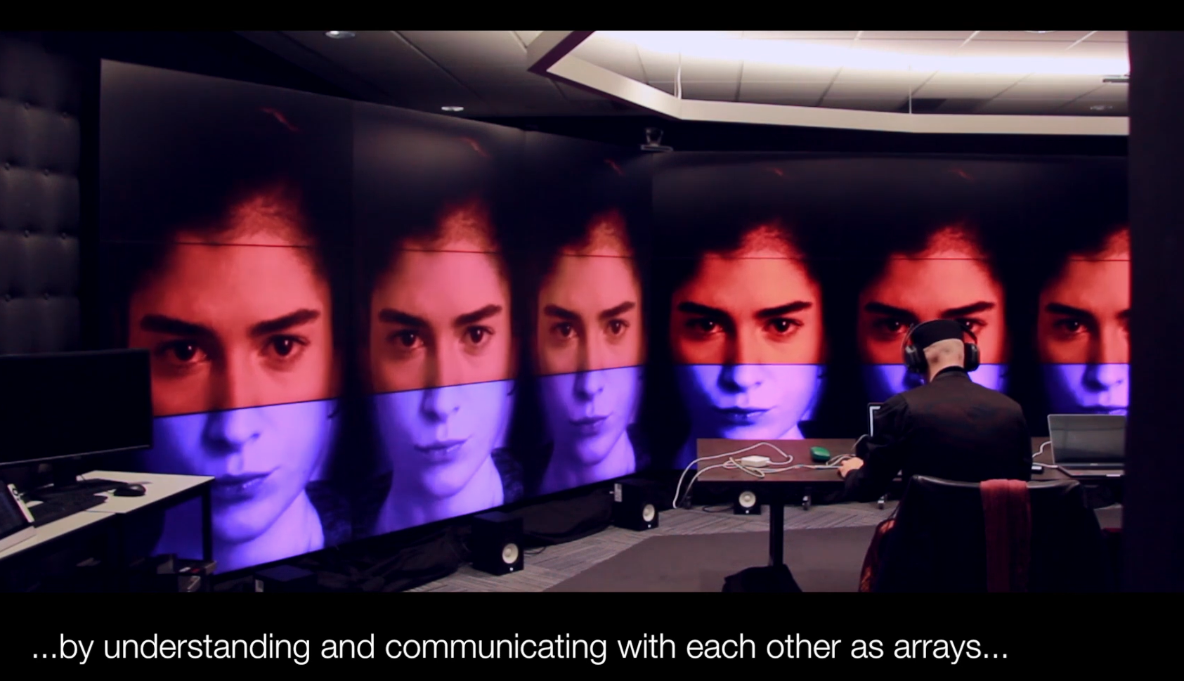
1. Composite Empathy/Identity Mapping
Concept: Using the multi-screen array to create composite facial overlays exploring concepts of identity, empathy, and collective representation.
Technical Execution:
Individual portrait photographs mapped across multiple screens
Overlay algorithms blending facial features into composite identities
Real-time adjustments to explore different weighting and combinations
Ultra-high resolution allowing detailed facial feature analysis
Research Questions:
How do we perceive "averaged" faces across demographic groups?
Can visual composites help develop empathy for collective experiences?
What happens when individual identity is abstracted into group representation?
Outcomes:
Powerful visual tool for discussions of diversity, representation, identity
Student engagement with complex social concepts through design
Demonstration of technology serving humanistic inquiry


2. Distributed Audiovisual Affective Design
Concept: Immersive multi-screen environments using color, light, and sound to create emotionally resonant spaces.
Technical Execution:
Synchronized video playback across entire screen array
Spatial audio integration creating immersive soundscapes
Live performance/lecture delivery within the environment
Real-time content manipulation responding to user/audience input
Applications:
Lectures as experiences - transforming standard presentations into immersive events
Affective mood regulation - testing how large-scale audiovisual environments influence emotional states
Collaborative design critique - viewing student work at unprecedented scale and detail
Event design prototyping - simulating installations before physical production
3. UX Research Visualization at Scale
Concept: Displaying complex user journey maps, research data, and design processes across multiple screens for collaborative analysis.
Benefits:
Spatial organization - different screens for different user personas, journey stages, or data sets
Collaborative viewing - entire teams can view and discuss without crowding around single monitor
High detail retention - zoom into specific data points without losing overall context
Comparative analysis - side-by-side visualization of different design iterations


Industry & UX Research Applications Demonstrated
The expanded VXLab capabilities now support:
For Industry Partners:
System design testing - complex combinations of systems, models, and data
Collaborative prototyping - distributed teams working on shared visualizations
High-resolution rendering - immersive audiovisual content at scale
Novel visualization networking - exploring new forms of data representation
For Design Research:
Multi-modal data display - integrating quantitative and qualitative research
Spatial organization of complex information - using physical space to structure cognitive understanding
Collaborative analysis - enabling group interpretation of research findings
Experimentation with scale and resolution - exploring how size affects perception and understanding
Student Learning Outcomes
Technical Skills
Operating advanced multi-screen visualization systems
Content creation for ultra-high-resolution displays
Networked system coordination and synchronization
Troubleshooting complex technical setups
Design Thinking
Designing for spatial, not just screen-based, experiences
Understanding how scale affects emotional and cognitive response
Collaborative design in shared physical-digital environments
Systems thinking for networked technologies
Professional Practice
Working within institutional technical constraints
Communicating across disciplinary boundaries (design ↔ engineering)
Managing complex projects requiring multiple stakeholders
Adapting creative visions to available resources
Institutional Impact
Expanded Facility Capabilities
Before this project, VXLab was primarily used for engineering visualization and robotics research. Now it serves:
Design students exploring immersive experiences
Psychology research on perception and emotion
Cross-disciplinary collaboration between STEM and creative faculties
Industry partnerships requiring large-scale visualization
Model for Interdisciplinary Innovation
This project demonstrated that:
Technical facilities can serve creative disciplines when approached collaboratively
Student projects can drive institutional innovation through novel use cases
Cross-faculty collaboration creates value beyond what individual departments could achieve
Agile, experimental approaches can expand capabilities without major infrastructure investment
Key Insights
Strategic Design Thinking in Action
The success of this project came from:
Deep listening - understanding technical constraints before proposing solutions
Collaborative framing - positioning design as complementary to, not competing with, engineering uses
Incremental innovation - starting small, proving value, expanding gradually
Documentation and knowledge transfer - ensuring innovations outlive individual projects
Bridging Technical and Creative Cultures
Lessons learned:
Speak both languages - understand technical specifications AND creative vision
Find mutual benefit - how does design use advance technical capabilities?
Manage expectations - creative ambition must align with technical reality
Build trust through delivery - prove concepts work before scaling up
Resource Constraints Drive Innovation
Working within limitations:
Can't change the hardware? Change how it's used.
Can't access expensive software? Develop custom solutions.
Can't dedicate facility full-time? Design workflows for shared use.
Can't predict all applications? Create flexible frameworks others can adapt.
Deliverables & Documentation
Custom Tools Developed:
Multi-screen content distribution system
Synchronization protocols for networked displays
Workflow documentation for future users
Training materials for students and staff
Student Projects:
Composite identity visualizations exploring empathy and representation
Immersive audiovisual environments for affective design research
Large-scale UX research mapping and collaborative analysis
Experimental spatial narratives using distributed screens
Knowledge Outputs:
Case studies documenting technical and creative processes
Best practices for cross-disciplinary collaboration
Frameworks for expanding research facility applications
Institutional memory ensuring sustainability beyond individual projects


Future Directions
Potential Expansions
Integration with motion tracking for responsive environments
Real-time generative content based on audience/user data
Cross-location networking (connecting VXLab with remote sites)
AR/VR integration creating hybrid physical-virtual experiences
Ongoing Applications
Annual student exhibitions utilizing the multi-screen array
Industry partner demonstrations and prototyping sessions
Research projects exploring perception, cognition, and emotion at scale
Continued tool development and workflow refinement
Key Takeaways
Interdisciplinary innovation bridging design, engineering, and research
Expanded institutional capability through creative reframing of existing resources
Student empowerment via access to advanced professional-grade systems
Collaborative model demonstrating value of cross-faculty partnerships
Sustainable impact through documentation and knowledge transfer
Strategic design thinking navigating technical constraints to achieve creative goals
The VXLab multi-screen project demonstrates that innovation doesn't always require new infrastructure—sometimes it requires new thinking about what existing resources can do.
AGILE UX Workshops
Industry UX | REA Group | RMIT
Agile UX | CO-Design | Workshop Co-Facilitation
AGILE UX Workshops
Industry UX | REA Group | RMIT
Agile UX | CO-Design | Workshop Co-Facilitation
REA Group: Agile UX Workshop Co-Facilitation
Industry-Academia Partnership | Experiential Learning Design | Methodology Training
#AgileUX #LeanUX #WorkshopFacilitation #DesignEducation #IndustryPartnership #UXMethodology #CollaborativeLearning
Project Context
In partnership with REA Group (Australia's leading property technology company, owner of realestate.com.au), I co-facilitated an intensive Agile UX workshop for RMIT design students. This industry-embedded learning experience gave students hands-on exposure to real-world UX methodologies, Agile workflows, and cross-functional collaboration practices used at scale.
My role: Co-facilitator and workshop designer, working alongside REA Group's senior UX practitioners to deliver an immersive, practice-based learning experience.
Learning Objectives
For students:
Understand differences between Waterfall and Agile UX methodologies
Experience Agile sprint cycles and iterative design processes
Practice rapid prototyping under time constraints
Develop collaboration skills across design and development roles
Build fluency with industry-standard UX tools and terminology
For REA Group:
Talent pipeline development (identifying emerging designers)
Community engagement and brand building
Feedback on UX education gaps
Contribution to design discipline advancement

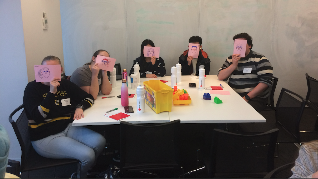
Workshop Design: Agile UX in Action
Opening: Methodology Framing
Waterfall vs. Agile: Embodied Learning
Rather than lecture about abstract frameworks, we used role-play and simulation to help students feel the difference:
Waterfall simulation:
Linear progression: Research → Design → Development → Testing → Launch
No iteration until final stages
Long feedback loops
High stakes if assumptions are wrong
Agile simulation:
Sprint-based cycles with continuous user feedback
Rapid prototyping and testing
Pivot-friendly based on learning
Incremental value delivery
Pedagogical insight: Students remembered the experience of each methodology far better than they would from slides alone.
Phase 1: User Understanding & Persona Development
Activity: Partner Interviews & Portrait Sketching
Students paired up to:
Conduct brief contextual interviews
Identify behaviors, motivations, pain points
Sketch quick self-portraits based on partner's description
UX Skills Developed:
Active listening - Extracting insights from conversations
Empathy building - Understanding user perspectives
Synthesis - Translating observations into user needs
Visual communication - Using lo-fi sketches to convey findings
Outcome: Proto-personas that grounded subsequent design work in real human needs rather than assumptions.


Phase 2: Workflow Mapping & Sprint Planning
Activity: Agile vs. Waterfall Journey Mapping
Teams visualized project journeys using both methodologies:
Waterfall tracks - Sequential phases, handoffs, long feedback loops
Agile tracks - Sprint cycles, continuous discovery, rapid iteration
Role Assignment:
Designer
Developer
Product owner
Stakeholder/user
Key Learning: Students experienced how Agile's iterative nature reduces risk, enables course-correction, and keeps user needs central throughout.
Phase 3: Rapid Prototyping – Paper Interfaces
Activity: Low-Fidelity Wireframing
Teams translated persona insights into paper prototypes:
User flows - Key journeys through the interface
Screen layouts - Lo-fi wireframes showing information hierarchy
Interaction logic - Annotations explaining behavior
Lean UX Principles Applied:
Test early, test often
Design for outcomes, not outputs
Bias toward action over perfection
Outcome: Testable concepts developed in under 60 minutes, demonstrating speed and learning focus of Agile approaches.


Phase 4: 3D Prototyping with Lego
Activity: Spatial UX Modeling
Building on paper prototypes, teams used Lego to:
Model interface zones as modular blocks
Construct user paths as physical journeys
Spatialize interaction flows and service touchpoints
Why Lego?
Tactile engagement - Different learning mode than digital tools
Collaborative building - Everyone can contribute simultaneously
Rapid iteration - Easy to test ideas and pivot
Metaphorical thinking - Translating abstract UX concepts into physical form
Design Concepts Explored:
Affordance (what invites interaction?)
Hierarchy (what's primary vs. secondary?)
User flow (how do people move through experiences?)
Accessibility (can everyone navigate this?)
Outcome: 3D "UX architectures" that sparked conversations about spatial thinking, service design, and multi-touchpoint experiences.


Deliverables & Learning Outcomes
REA Group Outcomes
Talent identification - Students demonstrated industry readiness
Brand building - Positive association with UX community
Recruitment pipeline - Several students later joined REA internships/roles
Curriculum feedback - Insights into education gaps and opportunities
Student Outputs
User personas grounded in research interviews
Journey maps comparing Waterfall vs. Agile approaches
Paper prototypes demonstrating core user flows
3D Lego models spatializing UX concepts
Reflection essays synthesizing learning
Key Skill Sets Applied:
Workshop design - Structuring experiential learning activities
Co-facilitation - Partnering with industry practitioners effectively
Agile methodology expertise - Translating frameworks into practice
Pedagogical innovation - Using embodied, tactile learning approaches
Stakeholder management - Aligning industry and academic goals
Adaptive facilitation - Responding to group dynamics in real-time
Portfolio Demonstration
This project showcases:
Industry collaboration - Effective partnership with leading tech company
Agile UX expertise - Deep understanding of Lean/Agile methodologies
Workshop facilitation - Designing and delivering engaging learning experiences
Educational innovation - Creative pedagogical approaches beyond traditional lecture
Talent development - Preparing next generation of UX professionals
Related Work
Blockchain Education UX
Future Learn | Blockchain Innovation
Learning Experience Design | Presentation design
curriculum development
Blockchain Education UX
Future Learn | Blockchain Innovation
Learning Experience Design | Presentation design
curriculum development
RMIT Blockchain Innovation Hub: Creative Blockchain Design Course
Learning Experience Design | Web3 Education | Complex Systems UX
#LearningExperienceDesign #BlockchainUX #Web3Education #InstructionalDesign #UXWriting #ComplexityReduction #CourseDesign
Project Context
In partnership with RMIT Blockchain Innovation Hub, I led the design and development of an online course module introducing creative professionals to blockchain technology and NFT ecosystems. The course launched on FutureLearn, a global massive open online course (MOOC) platform reaching thousands of learners worldwide.
The challenge: Make complex, technical blockchain concepts accessible to non-technical creatives while maintaining accuracy and enabling practical application.
My role: Lead learning experience designer, content strategist, and UX writer—autonomously developing all course materials with emphasis on smooth user learning journeys.
The (BIG) Problem Space
Knowledge Gaps
In from 2021-2022 and beyond, blockchain and NFTs exploded in public consciousness, but understanding lagged hype:
Artists wanted to mint NFTs but didn't understand underlying mechanics
Marketers saw potential but couldn't navigate Web3 ecosystems
Game designers heard about blockchain gaming but lacked practical knowledge
Educators needed frameworks to teach emerging technology responsibly and ethically due to lack of regulation
Complexity Barriers
Blockchain ecosystems present multiple UX challenges:
Technical jargon - Wallets, gas fees, smart contracts, tokenomics
Security risks - Scams, phishing, irreversible transactions
Fragmented experiences - Web 2.0 (traditional internet) + Web3 (blockchain) integration
Mental model mismatch - Decentralization concepts counter to centralized platforms users know
Learning Design Challenges
How do you design learning experiences that:
Simplify without oversimplifying?
Build confidence while emphasizing caution?
Enable action while teaching safety?
Serve diverse learners (artists, marketers, entrepreneurs, hobbyists)?


Design Approach: User-Centered Learning Experience
Phase 1: Learner Research & Persona Development
Target Audience Analysis: Defined six primary learner personas:
Blockchain-curious explorers - Want foundational understanding
Game designers & gamers - Interested in blockchain gaming economies
Professional marketers - Exploring blockchain campaign opportunities
Event promoters - Investigating blockchain ticketing/credentials
Digital artists - Want to mint and sell NFT artwork
Investors & entrepreneurs - Seeking financial opportunities
Phase 2: Learning Architecture & Content Strategy
Instructional Design Principles:
Scaffolded Learning:
Start with "why" (use cases and opportunities)
Build foundational concepts (blockchain basics, tokenomics)
Progress to "how" (practical steps to mint, transact)
Conclude with "what next" (utilities, rights, community)
Safety-First Approach:
Prominent warnings about financial risks
Explicit guidance on scam recognition
Step-by-step security protocols
Emphasis on research and caution
UX Writing Principles:
Plain language - Avoiding jargon where possible, defining when necessary
Chunking - Breaking complex topics into digestible pieces
Progressive disclosure - Revealing complexity gradually
Action-oriented - Clear next steps, not just information dumps


Phase 3: Course Structure & Learning Outcomes
Week 1: Understanding Blockchain & Digital Assets
What is blockchain technology?
Fungible vs. non-fungible tokens
Use cases across industries
Opportunities and limitations
Week 2: Navigating Web3 Ecosystems
Setting up wallets (safely)
Understanding gas fees and transaction costs
Exploring NFT marketplaces
Community norms and jargon
Week 3: Minting Your First Digital Asset
Preparing artwork/content
Technical requirements (file formats, metadata)
Step-by-step minting process
Pricing and listing strategies
Week 4: Rights, Regulations & Community
Intellectual property considerations
Legal and regulatory landscape
Community building and engagement
Ethical considerations and sustainability concerns
Learning Outcomes: By course completion, learners can:
Explain blockchain uses and opportunities
Understand tokenomics (fungible/non-fungible structures)
Execute necessary steps to mint digital assets
Navigate blockchain networks and communities
Assess IP rights and regulatory requirements
Engage confidently with Web3 ecosystems
Phase 4: UX & Accessibility Considerations
Platform Constraints: FutureLearn's structure required:
Mobile-responsive content
Screen reader compatibility
Bandwidth efficiency (global audience)
Consistent formatting across devices
Inclusive Design Decisions:
Text alternatives for all visual content
Captions for video content
Plain language for non-native English speakers
Optional deep-dives for advanced learners without overwhelming beginners
Safety & Risk Communication:
Prominent warnings about financial risks
Repeated reminders about security best practices
Resource links to scam databases and safety guides
Community moderation to prevent misinformation


Deliverables & Outcomes
Course Materials
4 weeks of structured content (text, video, activities)
Visual learning aids (infographics, process diagrams, screenshots)
Step-by-step guides for practical tasks (wallet setup, minting)
Discussion prompts fostering peer learning
Resource library (glossary, links, tools, safety guides)
Platform Integration
FutureLearn-optimized formatting for seamless user experience
Accessibility compliance (WCAG standards)
Mobile-first design (majority of learners on phones/tablets)
Engagement mechanics (progress tracking, completion badges)
Learner Outcomes
Thousands of global learners enrolled (exact numbers proprietary to FutureLearn)
High completion rates compared to platform averages
Positive learner feedback (see user testimonials below)
Practical application - Learners successfully minting first NFTs
User Feedback & Validation
Learner Testimonials:
"Finally, a course that explains blockchain without assuming I'm a developer. The step-by-step guides made me confident enough to actually mint my first NFT!"
"I appreciated the honesty about risks and scams. Too many blockchain courses are just hype—this one kept it real."
"The visual diagrams saved me. I'm a visual learner and the text alone would have lost me, but the combo worked perfectly."
"As a marketer, I needed to understand blockchain quickly for a client project. This course gave me exactly what I needed without wasting time."
"I loved that it wasn't just technical—the discussions about community, ethics, and sustainability made it feel more holistic."


Key Insights: Learning Experience Design
Complexity Reduction Without Dumbing Down
Challenge: Blockchain is genuinely complex—oversimplifying creates false confidence
Solution: Layered explanations—surface-level clarity with optional depth
Result: Beginners grasp concepts; advanced learners get nuance
Safety as Core UX Principle
Challenge: Financial scams prevalent in Web3 spaces
Solution: Prominent, repeated safety guidance throughout course
Result: Learners report feeling empowered but cautious (ideal outcome)
UX/CX Skills Sets Demonstrated
Learning experience design - Instructional design for online education
UX writing - Clear, accessible content for complex topics
Information architecture - Structuring knowledge for progressive learning
User research - Understanding diverse learner needs and motivations
Content strategy - Multi-modal approach (text, visual, video, interactive)
Accessibility design - WCAG compliance, inclusive practices
Risk communication - Balancing enthusiasm with caution
Autonomous project management - Self-directed delivery within deadlines
Portfolio Demonstration
This project showcases:
✓ Emerging technology expertise - Deep understanding of blockchain/Web3
✓ Complexity translation - Making technical concepts accessible
✓ User-centered course design - Multiple personas served effectively
✓ Platform optimisation - FutureLearn-specific UX considerations
✓ Global reach - Thousands of international learners
✓ Measurable outcomes - High engagement and practical application
Related Work
Sustainable and Regenerative UX Design
Land Art Generator Initiative | Re-Imagining Castlemaine
community-led co-design | proof of concept prototyping
Sustainable and Regenerative UX Design
Land Art Generator Initiative | Re-Imagining Castlemaine
community-led co-design | proof of concept prototyping
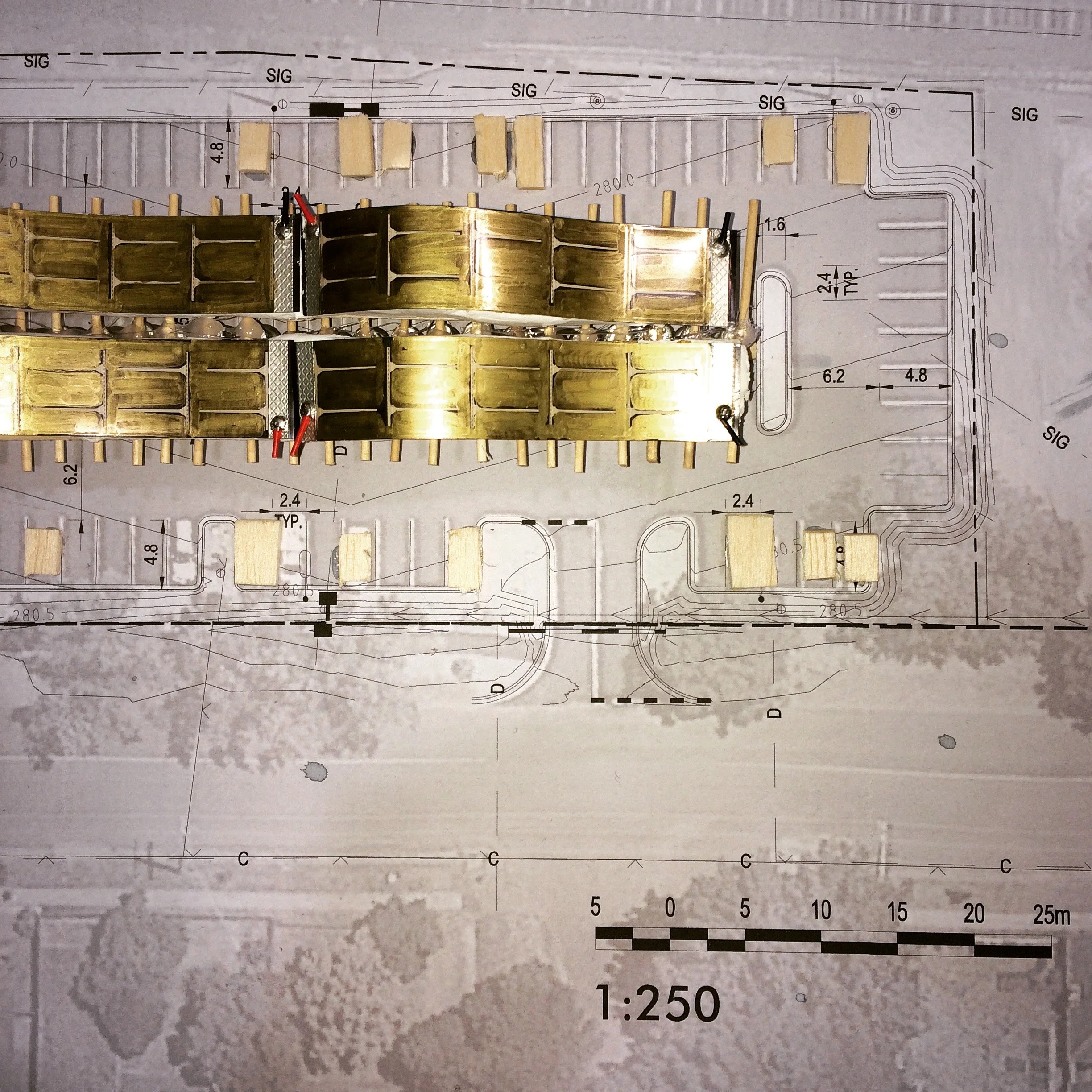
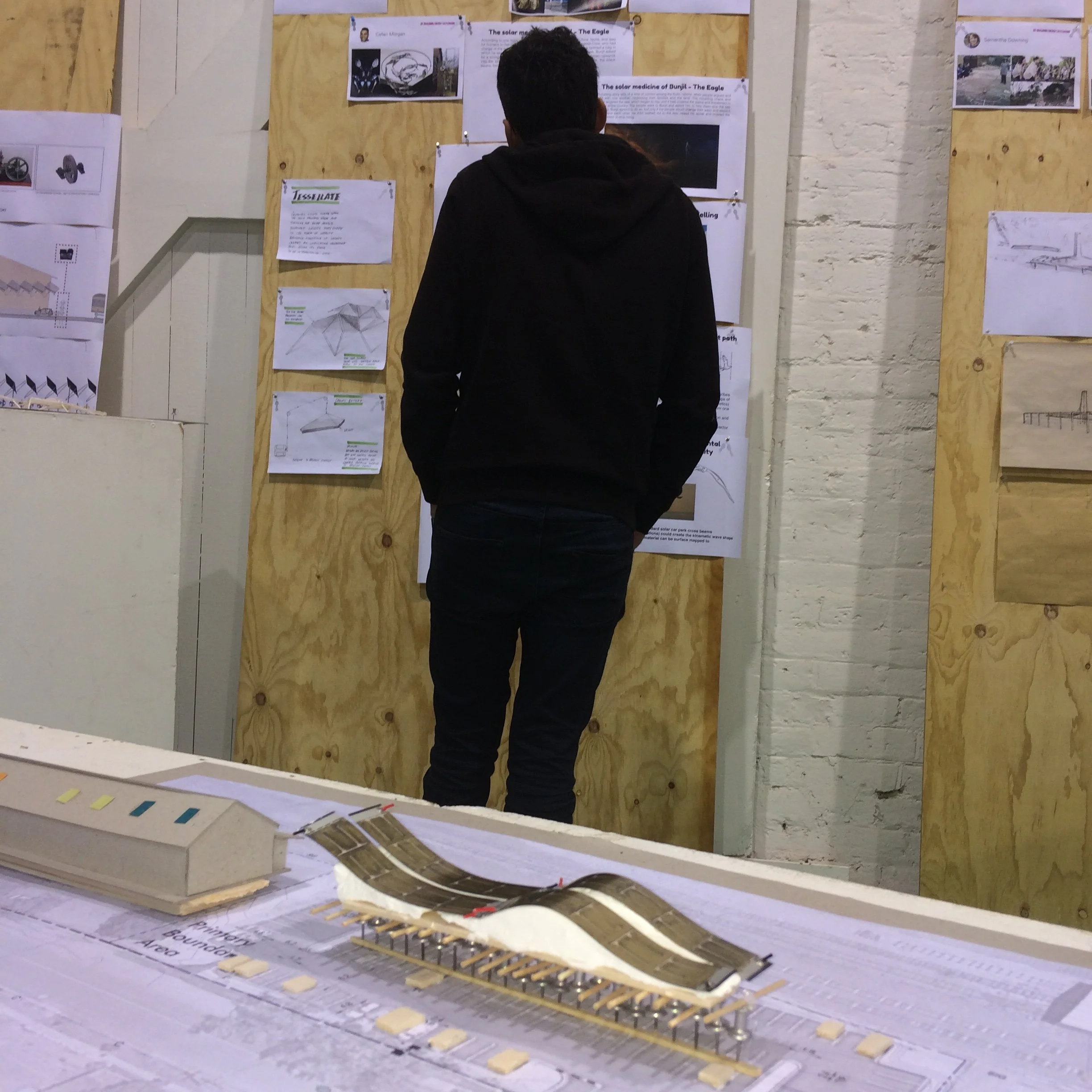
Land Art Generator Initiative: Re-Imagining Castlemaine
Community Co-Design Research | Sustainable Systems | Place-Based Innovation
#ServiceDesign #CommunityEngagement #SustainableDesign #StakeholderCollaboration #DesignForPlace #SystemsThinking #ParticipatoryCo-Design
Project Context
The Land Art Generator Initiative (LAGI) is a global design competition and public engagement platform exploring the intersection of renewable energy, public art, and community identity. The Re-imagining Energy Castlemaine workshop brought together local designers, architects, engineers, and community members for an intensive three-day design charrette focused on the historic Goods Shed Car Park—a heritage site at the heart of Castlemaine's cultural landscape.
My role: Design advisor, co-designer, and strategic consultant guiding interdisciplinary collaboration and community-centered design processes.
The Challenge
How do we design renewable energy infrastructure that serves both functional and cultural purposes—generating power while enhancing community identity and place attachment?
Traditional energy infrastructure is often:
Purely utilitarian, aesthetically bland
Disconnected from local cultural context
Designed without community input
Located away from public view
The opportunity: Transform energy generation into public art, cultural heritage, and community storytelling—making sustainability visible, beautiful, and meaningful.


Design Research Approach: Systems Thinking Meets Community Co-Design
Phase 1: Discovery & Stakeholder Engagement
Community Research Consultation:
Workshops with local residents, artists, business owners
Engagement with Castlemaine Art Society, Mount Alexander Shire Council
Consultation with Indigenous knowledge holders (Dja Dja Wurrung Country)
Technical briefings with VicTrack (rail infrastructure stakeholders)
Site Analysis:
Heritage constraints and opportunities (historic Goods Shed)
Energy generation potential (solar exposure, space limitations)
Pedestrian and rail traffic patterns
Cultural significance and community use
User & Stakeholder Benefit Mapping:
Daily commuters (train passengers)
Local community members
Tourists and visitors
Council decision-makers
Energy infrastructure operators


Phase 2: Co-Design & Concept Development
Design Research Brief: Create a renewable energy installation that:
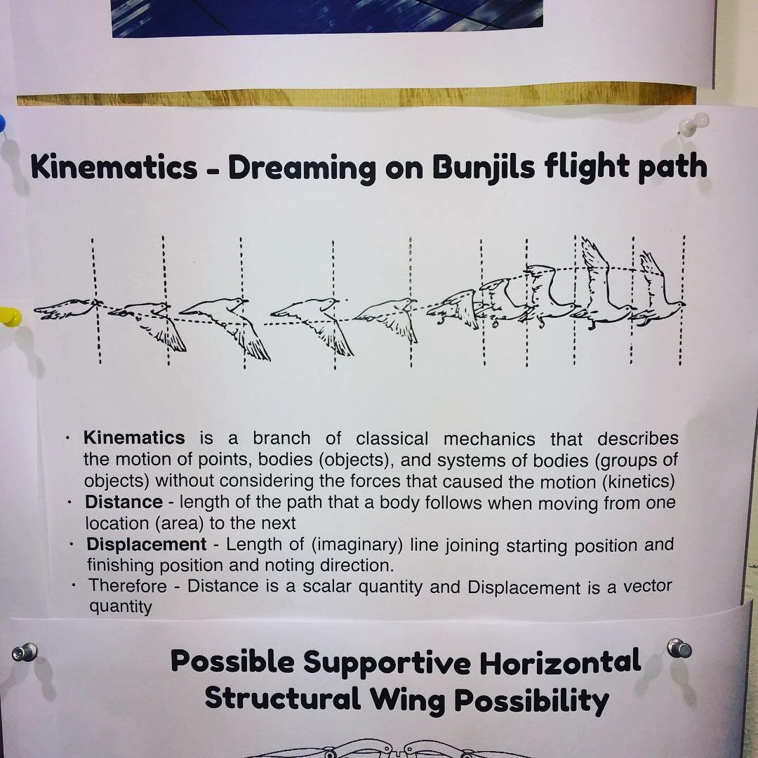
Generates measurable clean energy (~5 MWh annually)
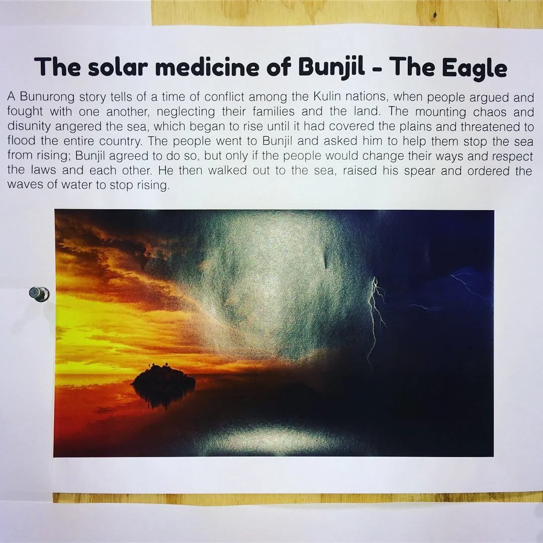
Honors Indigenous cultural narratives (Bunjil the Eagle creation story)
Respects heritage architecture
Engages multiple senses (visual + sonic experience)
Serves as both infrastructure and public art
Our Solution: "Bunjil's Wave"
Concept:
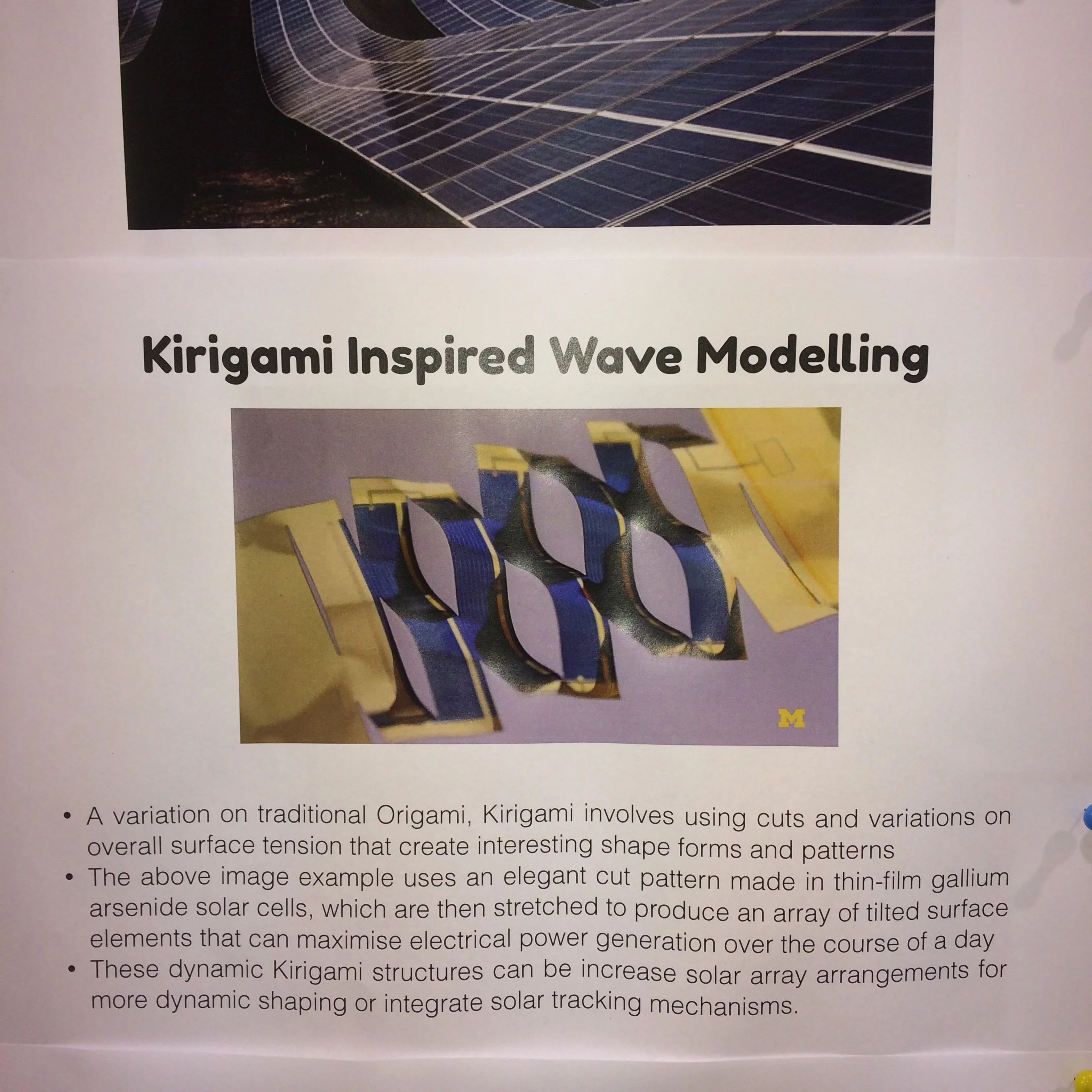
Replace existing skylights with translucent dye-sensitized solar cells (DSC) in wave-form geometry
Geometry inspired by Bunjil the Eagle's flight path (Indigenous creation story)
Kirigami-patterned panels allowing passive solar tracking without motors
Programmable LED uplighting for nighttime atmospheric experience
Sonic environment synchronized to train movements and environmental data
Design Research Rationale:
Cultural resonance - Form tells story of Dja Dja Wurrung creation narratives
Technical innovation - Kirigami lattice enables dynamic solar capture
Heritage integration - Warm uplighting enhances timber trusses rather than competing
Multi-sensory engagement - Light + sound create memorable experience
Community activation - Installation becomes destination, not just infrastructure
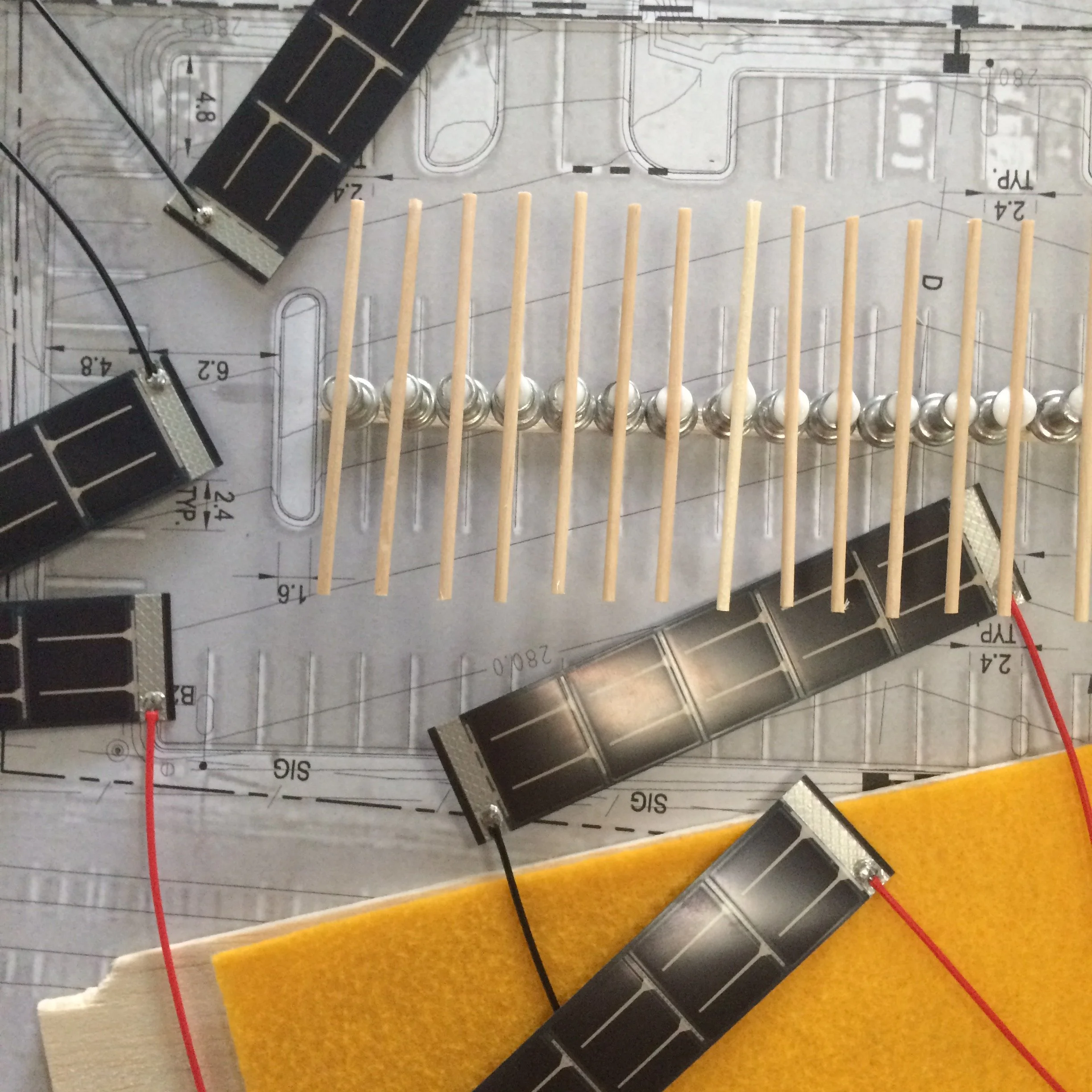

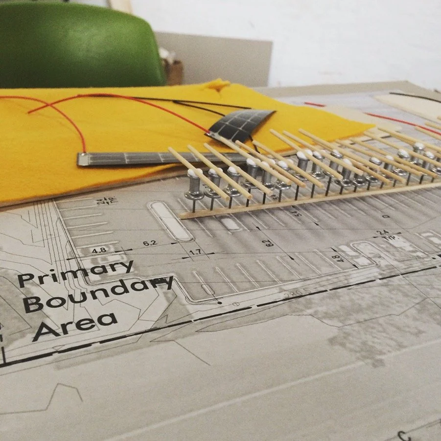
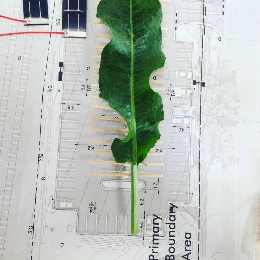
Phase 3: Prototyping & Testing
Physical Modeling:
1:200 scale model with interchangeable PV modules
Cardboard prototyping for rapid iteration
Testing of kirigami panel dynamics
Technical Research Validation:
Energy yield calculations (DSM sun-path analysis)
Structural feasibility assessment
Cost-benefit analysis
Maintenance requirements evaluation
User Research and Testing:
Soundscape prototypes tested with community members
Lighting mockups evaluated for atmospheric impact
Accessibility and wayfinding considerations


Deliverables & Outcomes
Design Research Outputs
A1 presentation boards documenting concept, research, technical specs
Physical scale model demonstrating installation integration
Energy yield study projecting annual generation (~5 MWh)
Interactive sound/light prototype showing dynamic responsiveness
Community presentation materials for public engagement and feedback
Stakeholder Outcomes
Council advisory input - Design recommendations informing future infrastructure decisions
Community visibility - Public exhibition engaging 100+ community members
Educational resource - Case study for sustainable design education
Cultural recognition - Honoring Indigenous knowledge in public infrastructure
Design Research Innovations
Kirigami solar panels - Passive tracking without mechanical systems
Heritage-tech integration - Demonstrating renewable energy can enhance historic sites
Narrative-driven design - Cultural storytelling as design principle
Multi-sensory infrastructure - Sound + light creating place attachment
Key Insights: UX Research & Systems Perspectives
Community as Co-Designer
Challenge: Energy infrastructure projects often bypass community input
Approach: Intensive co-design workshops placing local knowledge at center
Result: Design that reflects community values, increasing adoption potential
Systems Thinking for Sustainability
Challenge: Renewable energy seen as purely technical problem
Approach: Integrating cultural, aesthetic, experiential dimensions alongside energy generation
Result: Infrastructure that serves multiple purposes—functional, cultural, educational
Narrative Design for Engagement
Challenge: Technical infrastructure doesn't inspire emotional connection
Approach: Indigenous creation story (Bunjil) as design foundation
Result: Meaningful place-making that honors First Peoples' knowledge and creates shared identity
Prototyping at Multiple Scales
Challenge: Complex projects need validation before major investment
Approach: Physical models, energy calculations, user testing, cost analysis
Result: Reduced risk, informed decision-making, stakeholder confidence
Heritage Can Host High-Tech
Challenge: Assumption that old buildings can't accommodate modern systems
Approach: Sensitive integration respecting heritage while adding contemporary function
Result: Proof that renewable energy enhances rather than compromises heritage sites
Project Impact
Immediate Outcomes
Community research engagement - 100+ participants in workshops and public exhibition
Stakeholder buy-in - Council and VicTrack recognition of feasibility
Design validation - Technical and cultural viability demonstrated
Educational value - Case study for sustainable infrastructure design
Broader Implications
Replicable model - Framework applicable to other heritage sites
Policy influence - Demonstrating community-centered approach to infrastructure
Cultural precedent - Showing Indigenous narratives can guide contemporary design
Behavioral insight - Multi-sensory design increases dwell time and place attachment
Skills Demonstrated
✓ Stakeholder co-design facilitation - Managing diverse voices and interests
✓ Systems thinking - Integrating technical, cultural, aesthetic, economic factors
✓ User research - Community consultation and needs analysis
✓ Service design - Creating experiences beyond single touchpoints
✓ Sustainable design strategy - Balancing environmental and human needs
✓ Cross-disciplinary collaboration - Bridging design, engineering, policy, culture
✓ Prototyping methodologies - Physical, digital, and experiential testing
✓ Strategic communication - Translating complex concepts for diverse audiences
Related Work
Not for Profit | CX | Rebrand | Signage
nfp | VICSEG New Futures | digital asset rebrand
CX | fabrication and installation design
stakeholder management | Project management
Not for Profit | CX | Rebrand | Signage
nfp | VICSEG New Futures | digital asset rebrand
CX | fabrication and installation design
stakeholder management | Project management
VICSEG New Futures Training: Organizational Identity & Wayfinding Design
Brand Architecture | Environmental Graphics | Stakeholder Co-Design | Shopfront Signage
#OrganizationalDesign #BrandStrategy #WayfindingDesign #SpatialBranding #VisualIdentity #StakeholderEngagement #CulturallyResponsiveDesign
Project Context
VICSEG New Futures Training is the educational and vocational training arm of VICSEG, supporting newly arrived and multicultural communities through pathways into essential community and care sectors. As a registered training organization (RTO), their mission extends beyond education—they create equitable access, cultural belonging, and professional opportunity.
When launching a new Melbourne campus, they needed more than visual identity—they needed organizational storytelling that welcomed every learner through a threshold reflecting their values, communities, and aspirations
My role: Creative director, visual communication designer, and project manager coordinating stakeholder co-design, production vendors, and campus installation.
The Challenge
How do you design organizational identity that serves multiple stakeholders while honoring cultural diversity and building trust?
Stakeholder Complexity:
Students - Newly arrived communities, multilingual, varied literacy levels
Staff - Educators, administrators, support workers
Community partners - Referring organizations and support services
Regulatory bodies - RTO compliance and accreditation standards
General public - Building awareness and reducing stigma
Design Constraints:
Limited budget (community org, not corporate)
Tight timeline (campus opening deadline)
Heritage building considerations
Accessibility requirements (visual, linguistic, cultural)
Need for digital/physical asset consistency
Design Approach: Co-Design for Cultural Responsiveness
Phase 1: Discovery & Stakeholder Engagement
Stakeholder Workshops: Facilitated sessions with:
VICSEG leadership (mission, values, strategic goals)
New Futures Training staff (day-to-day operational needs)
Current and former students (user needs and pain points)
Community partners (referral pathways and expectations)
Key Insights:
Students need immediate visual reassurance - "Is this place for me?"
Staff need clear organisational alignment with parent VICSEG brand
Building needs welcoming presence visible from street
Identity must celebrate diversity without tokenism
Design should signal new beginnings, transformation, hope


User Needs Mapping:
Wayfinding - Where do I go? How do I find my classroom?
Belonging - Do I see myself reflected here?
Safety - Is this a trustworthy, secure place?
Aspiration - What future does this organisation offer?
Phase 2: Brand Strategy & Visual Identity Development
Brand Architecture:
Parent brand - VICSEG (established, trusted community presence)
Sub-brand - New Futures Training (education-specific, forward-looking)
Relationship - Aligned but distinct, complementary not competing
Visual Identity System:
Color palette - Warm, welcoming tones (avoiding clinical/institutional feel)
Typography - Accessible, multilingual-friendly fonts
Iconography - Universal symbols supplementing text
Photography style - Real students, authentic representation
Design Principles:
Clarity - Immediate comprehension across language barriers
Warmth - Emotional tone of welcome and support
Dignity - Respecting all learners regardless of background
Aspiration - Forward-looking, hopeful, transformation-focused
Phase 3: Environmental Graphics & Wayfinding
Large-Format Window Installation:
Design Challenge: Transform street-facing windows into:
Brand beacon - Visible organizational identity from outside
Privacy screen - Protecting student dignity and security
Wayfinding aid - Directing visitors to correct entrance
Cultural signal - Communicating values and welcome
Design Solution:
Translucent vinyl window treatment with logo, messaging, imagery
Layered information hierarchy - Quick-read branding + detailed messaging
Directional cues - "This way" arrows and entrance indicators
Cultural imagery - Abstract, inclusive representations of community
Technical Execution:
Production-ready files - Vector artwork, precise paneling, bleed specs
Site-specific adaptation - Measured to exact window dimensions
Installation coordination - Working with external vendors, quality control
Durability considerations - UV-resistant materials, easy maintenance
Phase 4: Digital Asset Extensions
Cross-Platform Brand Consistency:
Website graphics - Homepage hero, program pages, contact sections
Social media templates - Consistent visual language across platforms
Internal learning materials - Branded presentation templates, handouts
Signage system - Interior wayfinding, room identification, regulatory notices
Information Architecture:
Student-first content hierarchy - Most critical info surfaced prominently
Multilingual considerations - Space for translation, icon support
Accessibility compliance - WCAG contrast ratios, readable fonts
Deliverables & Outcomes
Design Outputs
Complete visual identity system (logo, colors, typography, imagery)
Large-format window installation (design, production files, installation)
Digital asset library (web graphics, social media, presentations)
Brand guidelines documentation (usage rules, file formats, scalability)
Wayfinding signage system (interior directional, room identification)
Stakeholder Outcomes
Increased visibility - Campus presence clear from street, foot traffic awareness
Student confidence - Welcoming environment reducing first-day anxiety
Staff efficiency - Clear wayfinding reducing confusion, freeing time for teaching
Brand recognition - Stronger organizational identity within community sector
Scalability - Design system applicable to future campus expansions
Organizational Impact
Enrollment growth - Increased inquiries attributed to campus visibility
Community feedback - Positive reception from students and partners
Operational efficiency - Reduced wayfinding questions, smoother campus navigation
Cultural validation - Students reporting feeling "seen and welcomed"
Key Insights: UX & Organizational Design
Co-Design Builds Ownership
Challenge: Top-down brand imposed on organization
Solution: Stakeholder workshops generating shared vision
Result: Staff and students felt invested in identity, not passive recipients
Architectural Branding as Emotional Infrastructure
Challenge: Physical space communicates before any person speaks
Solution: Environmental graphics setting emotional tone of welcome
Result: Reduced student anxiety, increased sense of belonging
Accessibility as Design Constraint Drives Innovation
Challenge: Multilingual, varied literacy audience
Solution: Universal symbols, clear hierarchy, cultural sensitivity
Result: Design that works for everyone, not just native English speakers
Systems Thinking for Brand Consistency
Challenge: Brand fragmentation across digital/physical touchpoints
Solution: Comprehensive asset library and usage guidelines
Result: Consistent experience regardless of student entry point
UX/CX Skills Demonstrated
Brand strategy - Positioning sub-brand within parent organization
Stakeholder co-design - Facilitating collaborative vision development
Visual communication design - Translating abstract values into visual language
Environmental graphics - Large-scale spatial branding and wayfinding
Cross-platform design - Maintaining consistency across media
Project management - Coordinating vendors, timelines, budget
Culturally responsive design - Creating inclusive, accessible identity
Production management - Print liaison, quality control, installation oversight
Portfolio Demonstration
This project showcases:
Organizational design thinking - Systems-level brand architecture
User-centered approach - Students and staff needs driving decisions
Cultural sensitivity - Designing for diverse, multicultural audience
End-to-end execution - Strategy through production and installation
Stakeholder management - Navigating community organisation dynamics
Tangible impact - Measurable outcomes (visibility, enrolment, satisfaction)
Related Work
Mini OS App
mac os | Rapid Prototyping
design research | development
Mini OS App
mac os | Rapid Prototyping
design research | development
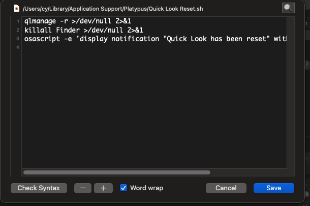
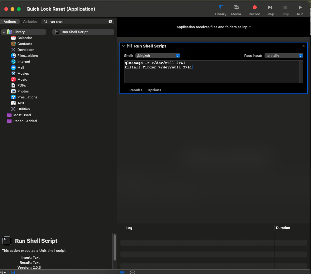
Quick Look Reset: Rapid Prototyping for macOS Utility
Micro-Application Design | User-Centered Problem-Solving | Rapid Prototyping
#RapidPrototyping #MicroApplications #UserCenteredDesign #ProblemSolving #MacOSUtilities #DesignThinking #CreativeTechnology
The Problem:
Quick Look is a beloved macOS feature—press spacebar on any file for instant preview without opening it. It's one of those invisible-until-broken features that, once you rely on it, becomes essential to daily workflow.
The opportunity:
Design a simple, one-click solution anyone can use—no Terminal, no setup, no fuss.
Design Approach: User-Centered Micro-Application


Phase 1: Problem Research & Root Cause Analysis
Research:
Researched how Quick Look works at system level
Identified common failure points (corrupted cache, daemon conflicts)
Tested safe reset methods (killing Quick Look daemon, restarting Finder)
Validated solution wouldn't cause unintended side effects
Design:
Zero technical knowledge required - Double-click and done
Safe - No risk of system damage or data loss
Transparent - Clear feedback when operation completes
Free & accessible - No barriers to download or use
Phase 2: Development
Shell Script Development: Wrote script to:
Quit Quick Look daemon (
qlmanage -r)Restart Finder (
killall Finder)Provide completion confirmation
UX Design:
App icon - Visual design communicating "repair/reset" function
Confirmation dialog - Clear message when operation completes
Error handling - Graceful failure if something goes wrong
Technical Implementation:
Used Automator (macOS built-in) for initial testing
Wrapped script with Platypus (free app-bundling tool)
Created standalone
.appfile requiring no installation
Phase 3: Distribution & Documentation
Hosting Strategy:
Uploaded to Nurobodi website for free download
No email capture, no account required, no strings attached
Direct download link (respecting user privacy and convenience)
User Documentation:
Simple instructions: "Download → Double-click → Done"
Brief explanation of what app does (transparency)
Note about macOS security prompts (first-run app warnings)

Value Add:
✓ End-to-end execution - Problem to solution without external dependencies
✓ User-centered thinking - Designing for real human frustrations
✓ Technical versatility - Comfortable across design and development
✓ Rapid prototyping - Speed without sacrificing quality
✓ Generous mindset - Creating value for broader community
✓ Practical problem-solving - Not just theoretical design thinking
Try It Yourself
If you’d like a copy of the app with no catch, no email, no subscribe, no BS. 💩 You can download the app here, free:
Additional UX Projects of Note
Additional UX Projects of Note
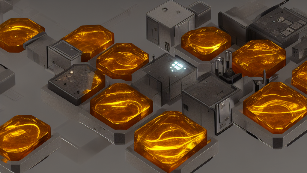
Nurobodi
Exploring how sound, light, and mood shape cognitive and emotional experience.

Nurobodi is a long-form research and design project I founded in 2017 to investigate how adaptive audiovisual feedback environments can support mental, emotional, and physical wellbeing. It bridges disciplines — affective (emotional) design, sonic interaction, colour perception psychology, and mindfulness — to prototype interactive systems and environments that support heightened awareness and regulate cognitive-emotional states.
Transformative Colour Resonance Environments (TCRE)
Resonance and Colour, as spectrum languages for designing and conveying impactful emotional experience, are more often than not subconsciously tied to memory, social constructs and dominant cultural or utilitarian functionality. This learning design, training and assessment course provides a structured design by research methodology which applies comparative analysis of empirical and quantitative studies of audiovisual-colour resonance and how modulations and transformations are affective. Individual user-research pathways are integrated within broader fields of UX/interaction design as technical and creative resonance and colour theory and research.